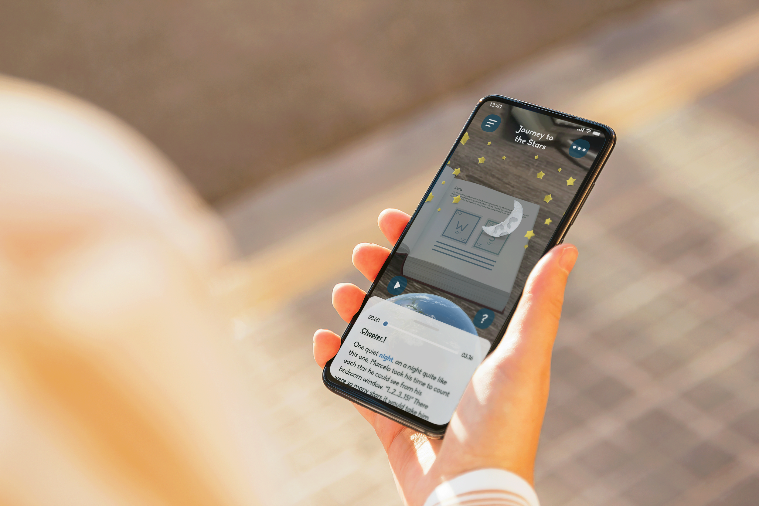
Conceptual-turned-Commercial Project
Reading Space
UX Research • UI Design • Branding
* This project has been renamed for my portfolio
01 —
BACKGROUND
Overview
Reading Space (RS) is a conceptual-turned-commercial project that started out as an idea by a developer I work with. His children currently use other applications to achieve similar goals as ours, but through research we found there were important features missing in these existing apps, such as an informative onboarding and multi-language support.
Criteria
The RS app is meant to showcase the power of AR (Augmented Reality), and other technological advances, while keeping kids engaged through a beautiful design and seamless flow. By setting up an AR scene through scanning a small image using the phone’s camera, potential users would be able to set up a digital world in front of them, and experience a story that can be seen and heard in real-time.
02 —
RESEARCH
UX Activities
The project manager, the lead developer, and I led a couple of meetings throughout the first phase of the project. We held a stakeholder workshop to iron out who would be doing what and when. After conducting a competitive analysis, I researched AR while leading a user research endeavor with guidance from the rest of the team. This helped us frame the problem area and create a hypothesis.
Stakeholder workshop activity using estimated weekly sprints, and the SIMS urgency matrix (i.e., 1=least urgent, 5=most urgent).
02 —
RESEARCH
Research Notes
Technology is at the point where we can push past the point of simply reading text or looking at images on a stagnant page. Much like the Harry Potter series magic newspapers and their respective portraits or images that move, change, and talk, augmented reading is arising as a fantastical experience.
“Learning is more effective when children engage with it voluntarily; therefore, it is necessary…to incorporate interesting technologies to create attractive learning environments.” TIE.
03 —
DEFINITION
Focus
Creating an intuitive app with quick access to tutorials was just as important as its aesthetic. Offering help in context, instead of giving users a long tutorial to memorize is important (Nielsen), and my solution for this was having an animated helper throughout the app. I also had to think about all types of accessibility issues a user might have (situationally, temporarily, and permanently), and came to the vital conclusion that we definitely need a visual reader in the app. Having a text aid would also make it easier to change languages in an app, which was an important finding in my interviews.
User Flow
The one main task is to successfully scan a book, and go through the process of reading it with help, if needed. The user flow contains many decision points such as getting help and changing language preferences, which I’ve illustrated in the diagram below.
04 —
DELIVERY
Sketches
Considering the business requirements, the user, market research, and journey mapping I did, I created hand drawn sketches using the Crazy 8s method. I then took these sketches and put together lo-fi mockups using Miro. This helped me build the information architecture, and assure the whole team that we were going in the right direction.
04 —
DELIVERY
Branding
The original name for the app was “AR Storybook”, but I convinced the team that we needed a name that was unique, and memorable to children and parents. With the animated helper in mind, I created a story around an animal astronaut, and that is where “Reading Space” was formed (pun intended).
Logo
The logo needed to be something distinctive that embodied the brand name, and practical enough for a child or parent to draw it absentmindedly (think: free marketing). I also decided to use a cyan, which the team loved.
Animated Helper
I selected a pre-existing set of graphics for the animated helper. Between a monkey, cat, and tiger, I chose the tiger because I thought the blue/orange-yellow (cool/warm) combination would be pleasant.
Usability Testing
Participants
3 children aged 6-12
2 parents aged 32 & 43
Test Objectives
Test the overall ease of navigating the app
Determine any obstacles users may have with completing their task(s)
Observe the preferences and tutorials a user navigates to and changes the most
Take note how often users go to tutorials and when
Understand a users thought process, their likes and dislikes
Tasks
Open the app and navigate through the intro screens
Scan a compatible AR book
Read the book start to finish
Change preferences (if needed)
Watch relevant tutorials (if needed)
Affinity Map & Priority Matrix
After the interviews, I synthesized user patterns and suggestions into an affinity map. The developer and I then created a priority matrix where we ranked and decided which changes to make for the app’s first launch. The biggest concern I had with the app was rewinding or fast-forwarding a book’s chapter, as this was not available. A couple of users were also adamant in suggesting changes to the menu, as it was too stark in contrast.
05 —
CONCLUSION
The Next Steps
From the priority matrix, the only change that was out of scope was iPad availability. It would require too much development man power, and would go way past the MVP. However, we are surely adding this device to the next round of product in the near future. I’ll be ready to create this responsive design!


